


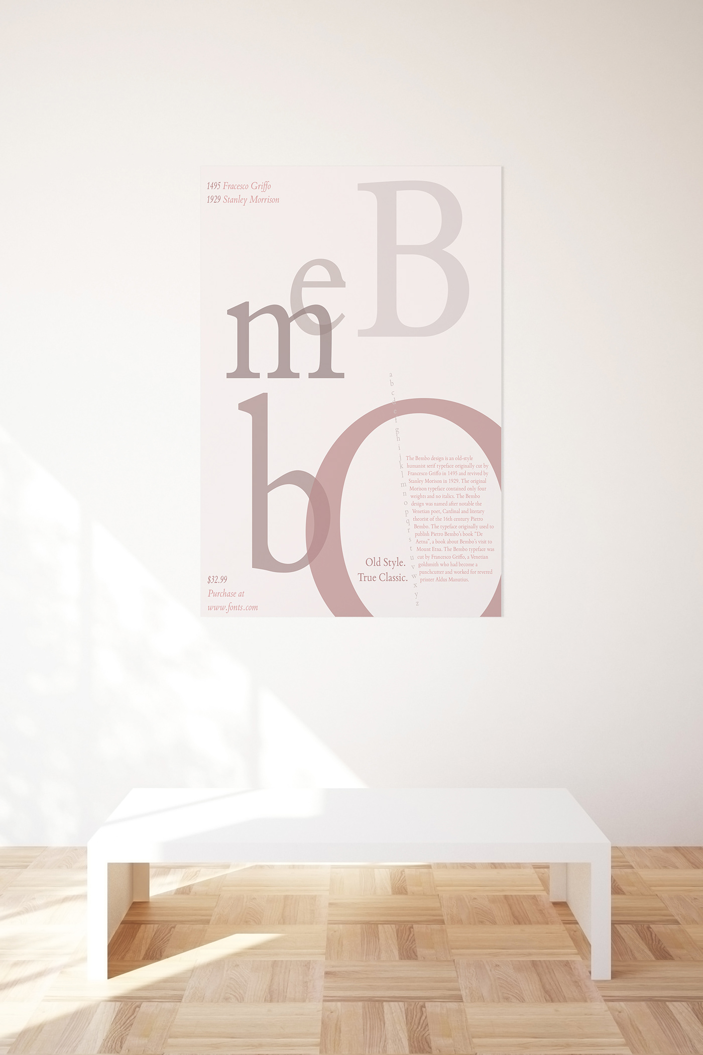
Final composition mockup photo of Bembo Font Poster
For this project, I had to design a mockup of my font poster. This is the final outcome and I am pleased with how it turned out! I focused on using the principles of design and color theory as I created this piece. The main principles that I focused on was focal point, alignment, and negative space. I used colors that complimented each other and the font I used is Bembo Book MT Pro.

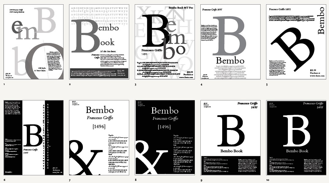
Bembo Poster Final
I wanted to show time evolving so to speak with the letters of the name to show that it came from such a long time ago in 1495 originally cut from Franceso Griffo and then was revived in 1929 by Stanley Morrison. I went with soft pinks because it is such a classic, it’s soft, and timeless. I wanted to showcase each letter of the name of the font in big letters while also showing the history and the alphabet in regular font and the year and names of the artists that created the font in Italics.

Poster Thumbnail Concept Sketches
Here are my concept sketches for my poster. I ended up going with my first sketch and I'm glad that I did.
Digital Sketches
Again, I went with my first design. I made a few minor changes for my final poster.
Final Look
Overall, this project was so fun and I am happy with my final!


